 Save and group your favourite furniture
  Create separate moodboards for each project
  Export your moodboards as PDFs

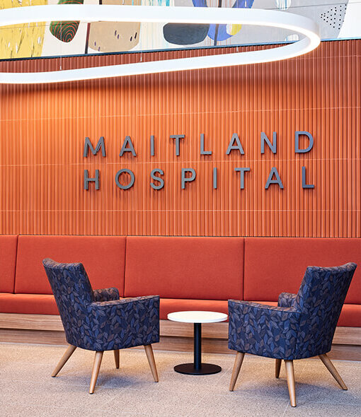

Designing for Ease of Movement
Wayfinding in aged care is not simply about helping residents find their way. It is about creating environments where movement feels natural, reassuring, and effortless.
When spaces are designed well, residents can navigate confidently without needing to stop, interpret, or second-guess where they are going. Movement becomes intuitive. Familiar spaces remain comfortable to use, encouraging independence and daily participation.
When environments lack these cues, even well-known settings can become harder to move through. Residents may hesitate at transitions, slow their pace, or avoid particular areas altogether. Over time, this can affect confidence, engagement, and overall wellbeing.
Furniture plays a significant role in shaping this experience. Positioned within direct sightlines and used continuously throughout the day, it becomes more than functional. It helps residents understand where to go, where to pause, and how to move safely through a space.
The Subtle Impact of Reduced Contrast
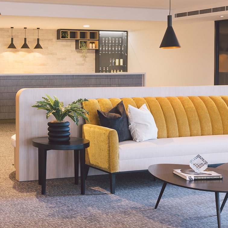
Aged care design guidance consistently identifies tonal contrast as essential to safe and intuitive navigation. Without clear contrast, important elements within a space can begin to lose definition.
Seating may visually blend into flooring. Pathways become less distinguishable. Edges and transitions soften, making it harder to judge depth, distance, and direction.
The impact is often gradual, yet highly influential. Spaces begin to require more effort to interpret rather than naturally supporting movement.
For residents living with low vision or cognitive change, this can directly influence behaviour. Movement may become more cautious, decision-making slower, and participation more limited, not through preference, but because the environment no longer supports ease and confidence.
Furniture as an Embedded Navigation Layer
Wayfinding is often considered as signage or directional guidance added into a space. In reality, residents experience navigation through the everyday elements already around them.
Furniture becomes one of the most immediate and consistent reference points within an environment. It signals purpose, anchors attention, and helps define how a space should be used.
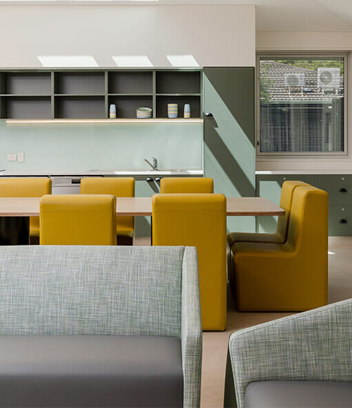
A clearly expressed dining setting naturally communicates where to gather. A visible lounge area provides a destination to orient towards. Thoughtfully placed seating can guide movement through corridors, shared zones, and transition spaces.
These cues may appear subtle, but together they reduce uncertainty and support more instinctive movement throughout the environment. Over time, furniture becomes part of the space’s visual language, reinforcing familiarity and helping residents navigate with greater confidence.
Designing Through Contrast and Familiarity
Environments that feel easier to navigate typically rely on a clear and consistent set of visual cues.
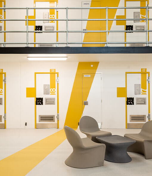
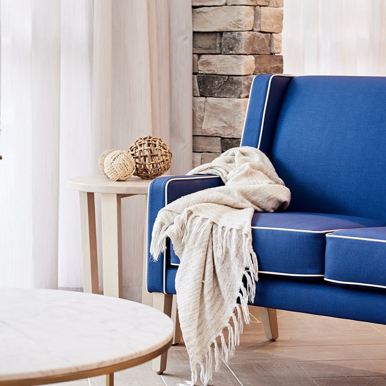
Tonal contrast plays a key role in this process, allowing furniture to stand apart from surrounding surfaces so it can be identified quickly and comfortably. As referenced within the National Aged Care Design Guidelines, visibility is most effectively achieved through tonal variation, such as Light Reflectance Value (LRV), rather than colour alone.
Material selection also influences how clearly furniture is perceived. Matte finishes and simple, well-defined forms tend to improve recognition, while reflective materials can create glare and reduce visual clarity. Highly complex patterns may introduce unnecessary visual noise, making spaces harder to interpret.
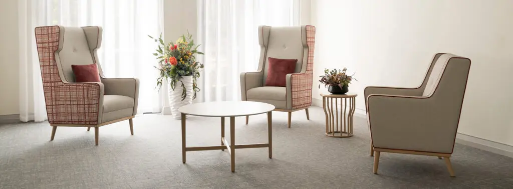
Consistency across environments further strengthens familiarity. When residents encounter similar visual cues throughout a community, navigation becomes more intuitive and requires less conscious effort. Placement is equally important. Furniture positioned in alignment with natural movement pathways can subtly guide flow, reduce hesitation, and improve overall spatial understanding.
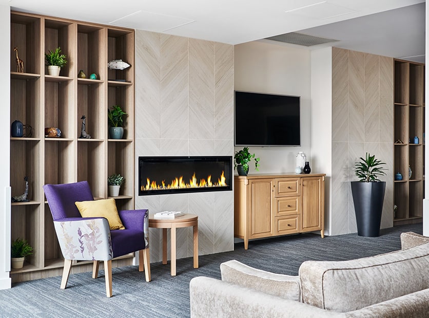
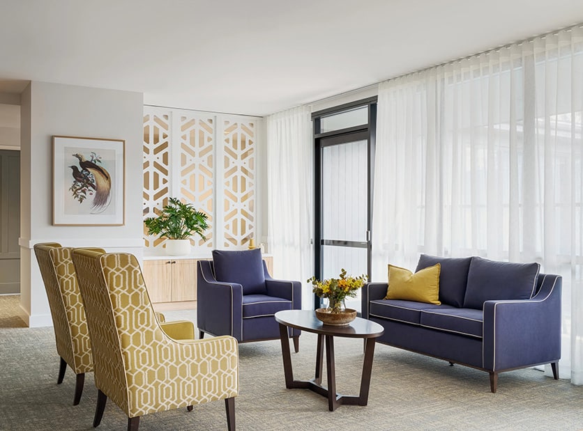
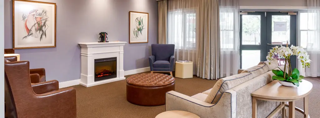
Importantly, these principles should always remain balanced with warmth and comfort. Successful aged care environments support navigation without feeling clinical, institutional, or overstated.
What Well Resolved Contrast Enables
When tonal contrast is thoughtfully integrated, movement through a space becomes more fluid and assured. Residents are able to navigate with fewer pauses, reduced uncertainty, and less reliance on prompts or assistance.
Safety is strengthened through clearer recognition of furniture, edges, pathways, and transitions. Everyday movement feels easier because the environment is simpler to interpret.
Over time, this contributes to something even more meaningful: confidence. Residents feel more capable within their surroundings, maintaining independence through daily routines, social participation, and self-directed movement.
From Furniture Selection to Everyday Experience
Furniture in aged care is often evaluated through durability, compliance, and aesthetics. While these considerations remain important, the lasting impact of furniture is experienced in how effectively it supports everyday life.
When furniture contributes to intuitive navigation, residents can move more confidently and comfortably throughout their environment. Daily actions require less effort. Familiar spaces feel easier to understand and more reassuring to use.
Over time, these seemingly small interactions shape the overall living experience, creating environments that feel predictable, supportive, and empowering.
In aged care, where independence is often experienced through everyday moments, that difference matters deeply.


Get in touch today