 Save and group your favourite furniture
  Create separate moodboards for each project
  Export your moodboards as PDFs

Fabrics, Colours & Patterns That Make a Difference
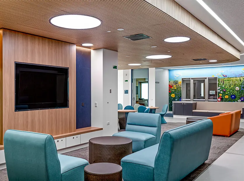
For someone living with dementia, everyday spaces can feel confusing, overwhelming, and unfamiliar. For decades, Crown Furniture has been dedicated to creating environments that bring calm, clarity, and comfort, spaces that support independence, nurture wellbeing, and help people feel truly at home.
In dementia care, this purpose becomes even more meaningful.
As Professor Mary Marshall from the University of Stirling notes, “Dementia as a disability is characterised by an acute sensitivity to the built and social environment.” When memory, perception, and sense-making begin to shift, the environment becomes more than a backdrop, it becomes an active form of care.
For people living with dementia, the purpose of the environment is to support independence, reduce confusion and stress, and enhance overall quality of life. A well-designed space can compensate for cognitive changes, reinforce remaining abilities, and help people feel safe, oriented, and socially connected.
The National Aged Care Design Principles and Guidelines echo this understanding: busy, cluttered or noisy environments can heighten disorientation, agitation and confusion, particularly for people living with dementia. This is why dementia-friendly design must go beyond appearance. It becomes a subtle, intentional act of care, one that calms rather than overwhelms.
Supporting Safer Navigation and Ease of Movement
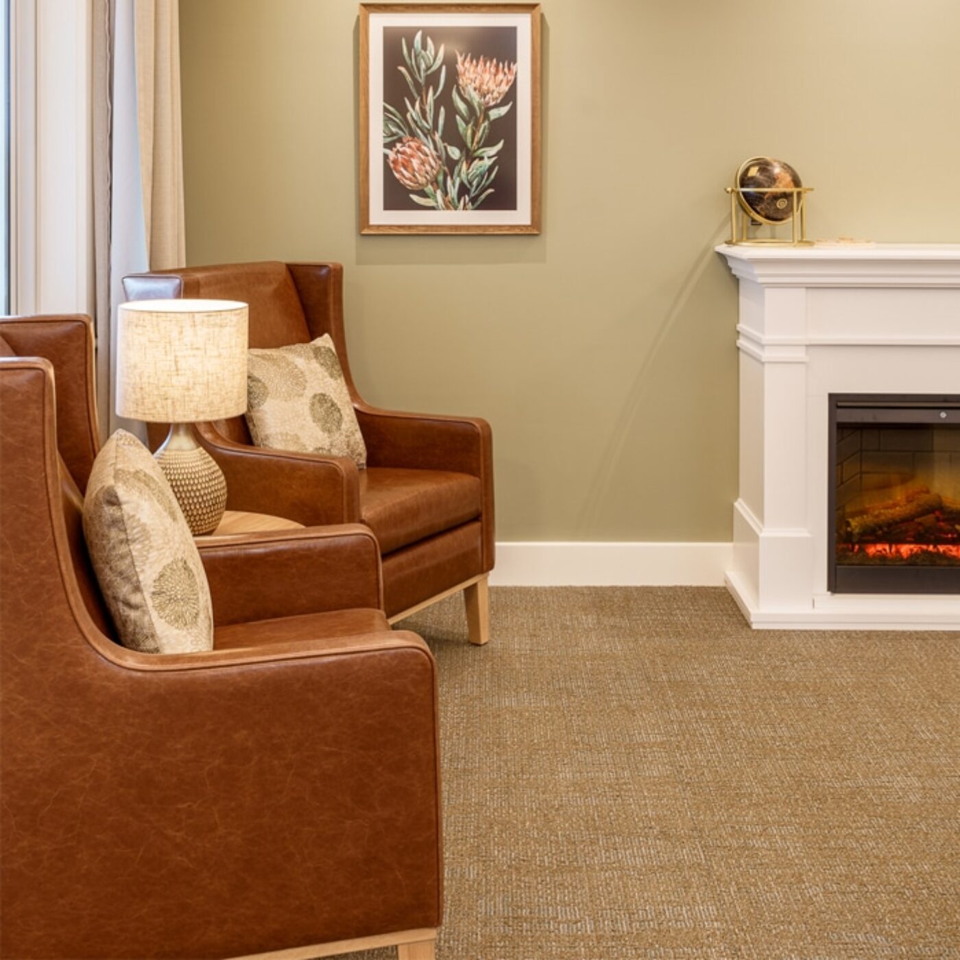
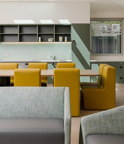
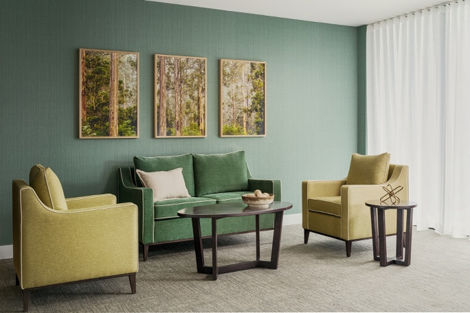
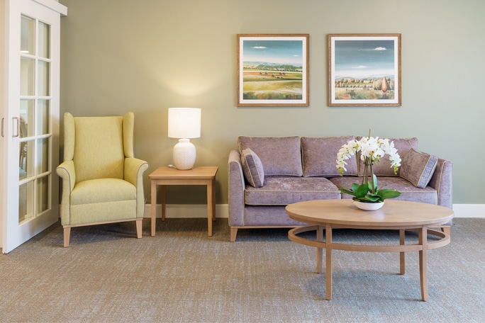
When designing for dementia, the interaction between fabrics, colours and patterns has a profound impact on safety and wellbeing. People living with dementia are up to eight times more likely to fall, and visual cues significantly influence how they navigate a space.
Many residents experience reduced vision or altered perception. This makes tonal contrast, the difference in lightness or darkness between surfaces, far more important than the colour itself.
A colour’s Light Reflectance Value (LRV) becomes an essential tool. For example:
• A light plate on a dark dining table is easier to see
• Two bright colours with similar tones may appear identical
• Strong tonal contrast helps residents differentiate objects and surfaces
Although colour psychology is often discussed, research shows limited evidence that specific colours reliably alter mood in dementia care. What truly matters is creating spaces that feel clear, familiar and easy to navigate.

Supporting Calm and Confidence Through Pattern Choices
Patterns can significantly influence how a person with dementia interprets space. High-contrast, busy or irregular designs may look stylish, but they can easily become visually confusing.
For someone living with changes in depth perception or visual processing, even familiar patterns can take on new and confusing meanings, like:
• Obstacles
• Steps or holes in the floor
• Moving surfaces
This can create hesitation, agitation or even contribute to falls.
To support comfort and clarity, patterns should:
• Keep simple and subtle designs to help maintain clarity
• Avoid motifs that resemble real objects to prevent confusion
• Be at a consistent scale and ensure they harmonise with surrounding tones, contributing to a more reassuring atmosphere
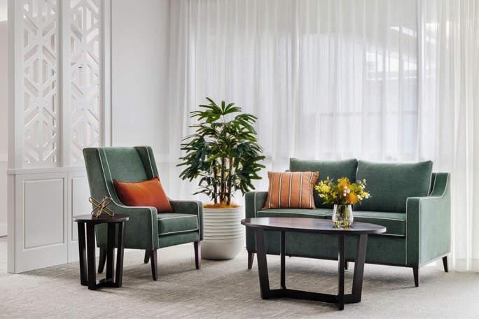
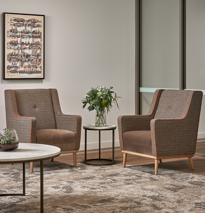
Soft, woven fabrics with understated patterns offer warmth and familiarity without creating visual noise. When chosen thoughtfully, patterns help residents feel grounded, oriented and more at ease.

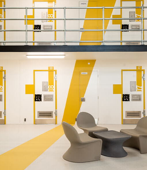
Designing With Purpose, Greater Impact
Purposeful dementia design doesn’t demand major renovations. Many impactful improvements are simple and cost-effective:
• Avoid reflective surfaces to reduce glare
• Use low contrast to visually minimise staff-only areas
• Use high contrast between chairs and flooring to support seating recognition
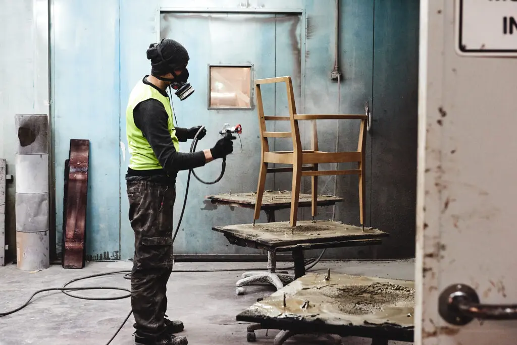
• Select durable, non-porous fabrics that feel familiar and home-like
• Keep furniture placement consistent to reinforce familiarity
Brighter lighting and clear tonal contrast, especially in dining areas, have been shown to reduce agitation and encourage comfortable, social mealtimes.
When colours, fabrics and patterns work together with intention, they do more than enhance a room. They help residents feel safer, calmer and more supported in daily life.
Fit-for-Purpose Legacy For Dementia Care
As we carry our fit-for-purpose legacy forward in dementia care furniture, we remain dedicated to designs that bring clarity, comfort and dignity to every day. Gentle contrasts that support visibility, fabrics that evoke home, visual cues that aid recognition, and materials that prioritise hygiene all play a part in helping residents feel safe and confident. These principles have shaped our craft for 50 years, and they continue to guide us as we design environments where people living with dementia can move, rest and live with greater ease and dignity.
Create calmer, safer dementia-friendly spaces.
Connect with us to explore materials and solutions that make a meaningful difference in dementia care environments. Visit our contact page or reach out to our team at 1800 194 194 today to learn more about how we can help transform your facility.
Get in touch today